Scaling an Enterprise Tool That Creates In-App Guides
Designed for enterprise content authors, the focus was on unifying fragmented workflows into a seamless, scalable interface that enhances clarity, efficiency, and confidence.
Company
Whatfix
Team
Product Designer (My Role), PM, Tech Lead, UI Developer
Stage
Redesign + Workflow Consolidation
Platform
Web
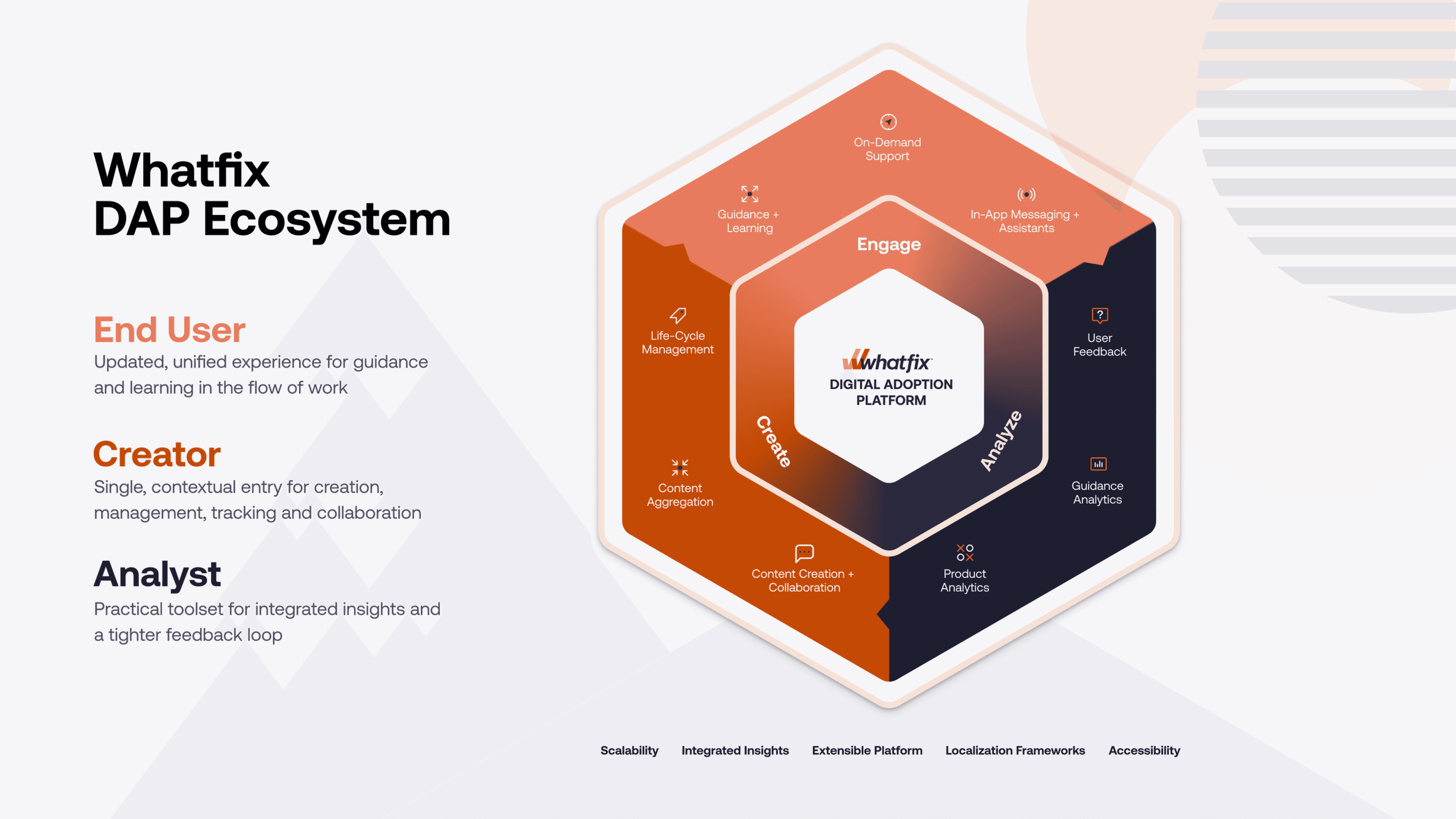
Background : What is Whatfix?
Whatfix is a leading Digital Adoption Platform (DAP) used by enterprises like Cisco, Microsoft, and Bausch + Lomb. It enables product teams, L&D teams, and IT admins to create in-app guidance, training flows, tooltips, and more without writing code.
Over the years, Whatfix’s authoring experience had become fragmented. Authors needed to toggle between dashboards and browser extensions to manage content. With multiple tools stitched together, the experience felt... disjointed.
📊 Impact
80%
of key tasks now completed within a single tool
90%
reduction in tool switching between dashboard and extension
33%
faster task completion, based on usability test benchmarks
+18
NPS lift for Studio experience (from 31 to 49 in 6 weeks)
+22%
in trial-to-publish rate (34% → 56%)
4×
more shared components, adopted across 3 pods
🌱 Setting the Scene
When I joined this initiative, the content authoring experience at Whatfix felt fragmented. Authors bounced between tools creating content in one interface, managing it in another, and analyzing results somewhere else.
It wasn’t just inconvenient. It was costing us.
Some users told me they didn’t know where to start. Others avoided using advanced features altogether because they worried they might break something. Even experienced authors leaned heavily on support to fix mistakes. I saw how this confusion was hurting confidence.
Our sales team had a tougher pill to swallow. Nearly 13% of prospects dropped off after demos, citing the UI as “dated” or “confusing.”
I knew we needed more than a visual fix. We needed to rethink how authors create, manage, and publish content in Whatfix.

❗ The Problem
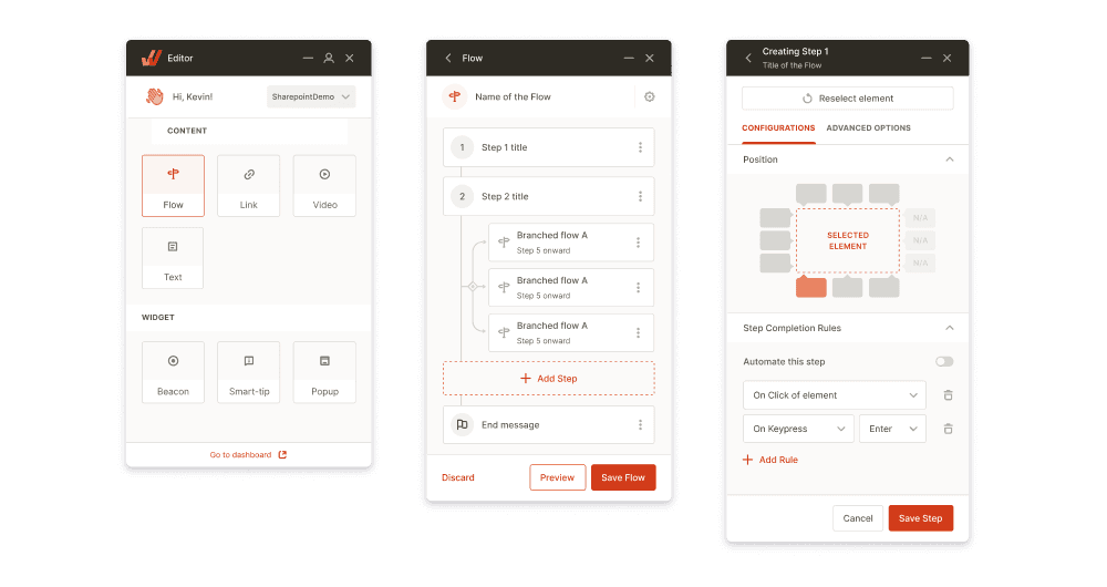
A typical flow creation journey looked like this:
Create (via extension) → Manage (in dashboard) → Test (in extension) → Publish and Analyze (back in dashboard)
That meant switching between tools five times for a single guide.
I mapped this experience and surfaced three consistent issues:
No consistent place to start or resume work
Constant back-and-forth between interfaces
Visual and structural inconsistencies across tools
This wasn’t just slowing authors down. It was creating anxiety about doing something wrong.
🎯 The Vision
We wanted to build one workspace that could flex to meet an author’s needs. Something modular, predictable, and efficient. My goal was simple:
Can authors complete 80% of their workflows in one place?
Design principles I followed:
Consolidate tasks into a single workspace to keep users focused and in flow.
Organize the UI by user goals to improve clarity and scalability.
Ensure consistent behavior across screen sizes and tool environments.
Maintain visual and structural consistency
Approach
Grounding the problem
Analyzed 50+ session recordings and reviewed NPS feedback. I also interviewed 5 enterprise authors from different verticals.
One quote stuck with me:
Defining success
Defined the north star metric as:
Supporting KPIs included reduced tool switches, faster time-to-publish, and increased flow starts.
Exploring solutions
Idea | Description | Outcome |
|---|---|---|
Sidebar-first layout | Persistent left nav with all tools | ✅ Best usability and scalability |
Tabbed modal menu | Quick-pick overlay | ❌ Lacked visibility |
Global dropdown switcher | Tool select from top nav | ❌ Too buried |
Chose the sidebar model for its clarity and flexibility. It worked well with our growing product surface.
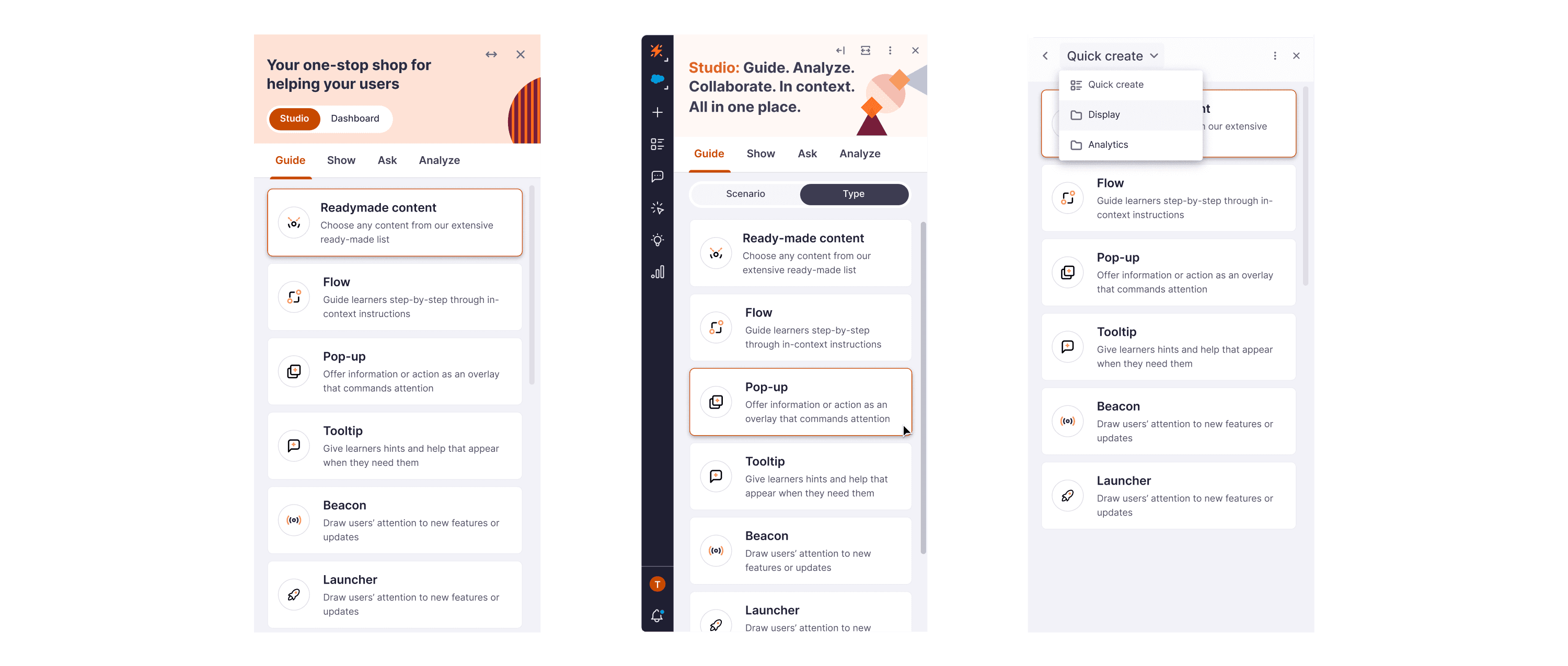
Nav Options for Testing
Exploring Countless Iterations and Ideas
Validating the design
Prototyped the Studio redesign and tested it with 7 users.
Results:
33%
Task completion improved
2x
Authors located and resumed draft flows
3x
Usability confidence increased across the board
Some Customer Testimonials
🎨 Final Design
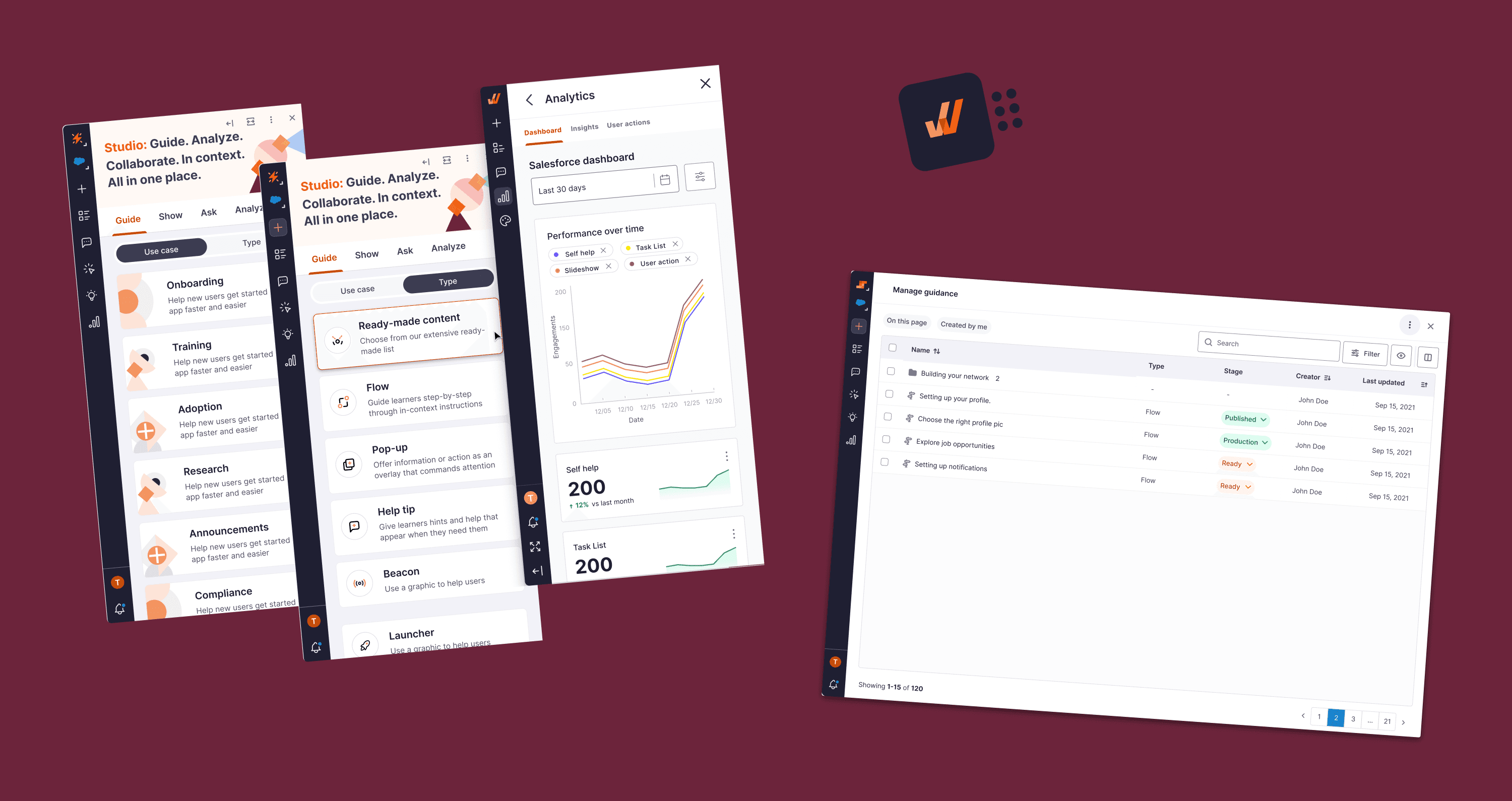
Unified Homepage
A single launchpad for all authoring actions.
Users can now create, resume, or measure all from one place.
One centralized launchpad for seamless authoring start, continue, and track content effortlessly.
Left-Side Navigation
Introduced a compact left-side navigation bar with labeled tool icons, allowing users to switch between tasks effortlessly without leaving their current context
Redesigned the navigation with a modern, expandable layout and fluid horizontal movement for seamless exploration
Built a scalable UI that empowers users to create and edit guidance and content directly in context
while seamlessly managing, analyzing, and engaging with related tools
Consistent Visual Language
Reimagined the product interface with a focus on core user journeys from content creation to analysis.
Resulting in a modern, unified design system that enhances efficiency and engagement
Refreshed the interface using unified spacing, colors, and type hierarchy.
This gave the product a more modern and trustworthy feel.


🧠 My Contributions
Defined the core problem using analytics, user feedback, and interviews
Led ideation and prototyping of three design directions
Conducted usability testing and iterated with real users
Collaborated with engineers to implement tokenized UI components
Balanced visual polish with legacy system constraints
⚠️ Challenges I Faced
Recruiting users across time zones took longer than expected
Some existing UX debt was out of scope
Engineering feedback came late in the cycle due to bandwidth
Design system limitations forced creative workarounds
🌱 What I Learned
This was one of the first times I saw a design-driven roadmap take hold because it clearly aligned with user and business goals.
Key takeaways:
A solid navigation model builds trust
Early validation reduces rework
A strong system foundation improves team velocity
Good design becomes a selling point when it’s intuitive and confident